Dec 2023 - Apr 2024
Building a colour system
The Problem
With multiple sources of truth and design system that barely had documentation, PC Financials banking application have struggled with subpar user experiences and visual design inconsistencies. One area where the issue stood out the most was the use colours and the lack of colour system. In result, our team have struggled with the following:
The design team coming up with subpar, inconsistent and off-brand user experience.
Work friction between the developers and designers because of inconsistencies between local style colours in Figma and in the code base.
Not being able to work agile and speed prototype.
Inaccessible colour choices.
Duplication of common components, colours, styles, typefaces etc.
The Goal
Unify our colour system so there's only one source of truth for all the teams.
Create a robust colour system and documentation
Use Figma's new variables and modes feature for easy theming, management and the capability of assigning multiple variables in one component.
All for working agile, consistent and removing friction between teams in order for us to focus on solving solving the problem of the users and not get caught up in our own processes.
Challenge
We were given 2 weeks merge and clean-up our Figma files, the code base on developer's end. Colour variables were implemented the year after when Figma released the feature.
How might we unify colour and create a design standard that would not only be more consistent and quicker to implement, but delightful to use and built to last.
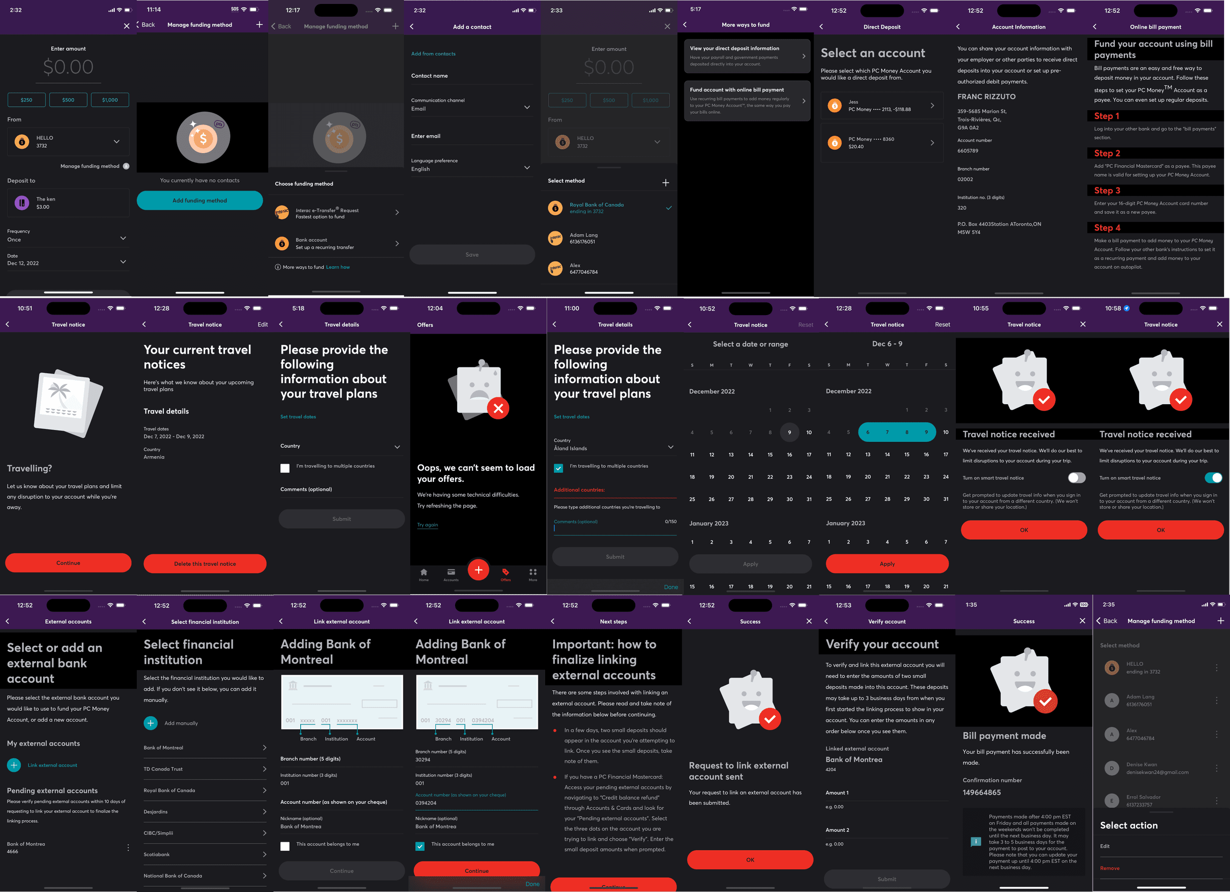
Some examples of the problem below:
Dark mode was implemented by developers, not designers. They did not know the colours which resulted in “Zebra dark mode screens”. (A visual bug where components and surfaces appear in different greys and blues that make it harder to use the application.)
Brand and marketing team had their own set of colours they were using from the agency they used to work with.
UI elements that didn’t change colour and now hidden in dark mode causing accessibility issues.
UI elements that didn’t change colour and now are too bright and distracting or for dark mode screens. Or elements are given an inappropriate colour for dark mode.
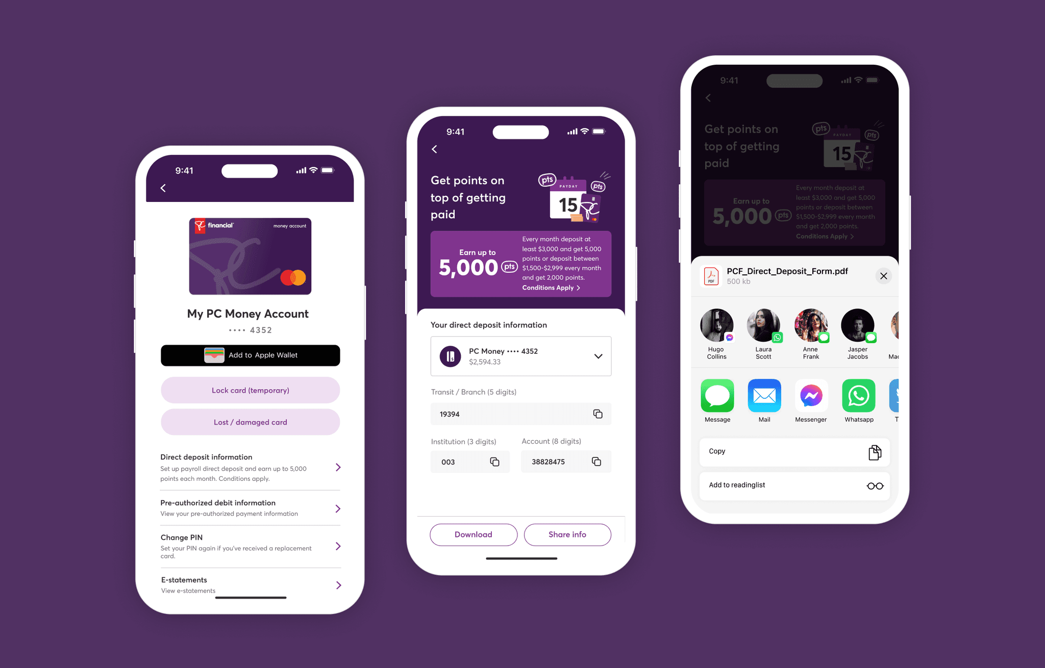
Inconsistencies across iOS, Android, web and what was designed on Figma.


RESEARCH
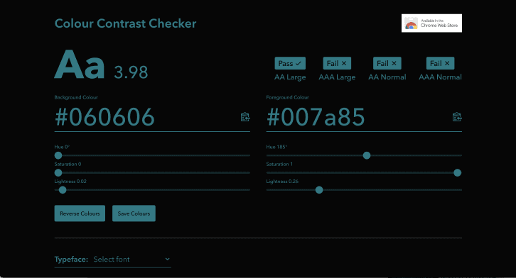
Full colour audit and accessibility
We first established communication before we started the audit. A design system forum was set on weekly cadence. We also created a governance model to approach the problem. Through this meetings we compared and removed redundant colours and communicated to our developers the changes on our end. All proposed changes were captured through a Figma folder we have setup where we pulled legacy colours and colours that are already in production.
We have decided to keep the that were supposedly removed if a component in production is still using it.
During this audit, I also checked for accessibility making sure that all colours we kept are accessible on both light and dark mode.
Below were some of our audit findings:
Many were failing in dark mode.
Colour theory and use of colours to evoke emotion – red and teal were used as action colours.
There's lack of rules and guidance on when to use these colours.


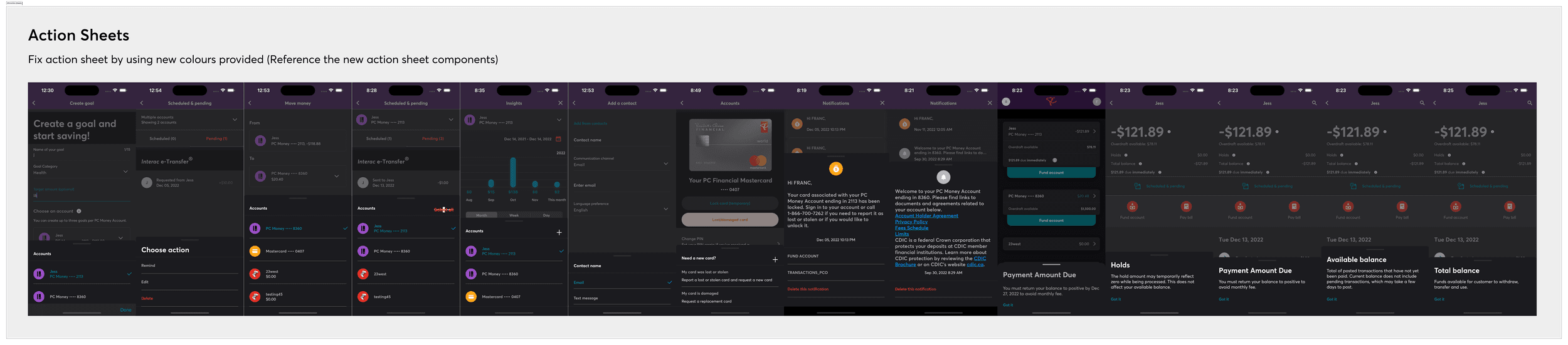
IMPLEMENTATION
Local styles organization, documentation and hand-off
We provided the new colour system guide and documentation that we all used as the new source of truth.


MORE IMPROVEMENTS
Upgrading our colour system through variables and modes
Variables in Figma design store reusable values that can be applied to all kinds of design properties and prototyping actions. They help save time and effort when building designs, managing design systems, and creating complex prototyping flows.
Challenges in migrating
Since this was a fairly new feature before we adopted, the entire team were apprehensive in using the feature. To make sure there are no bugs, we have tested variables while keeping our local colour styles intact. After confirming the feature's stability, our team started using variables for colour styling which made theming just a one click button job.
Check out
other cool projects
PC Insiders